Jackpot Cookies - Rebrand & Art Direction
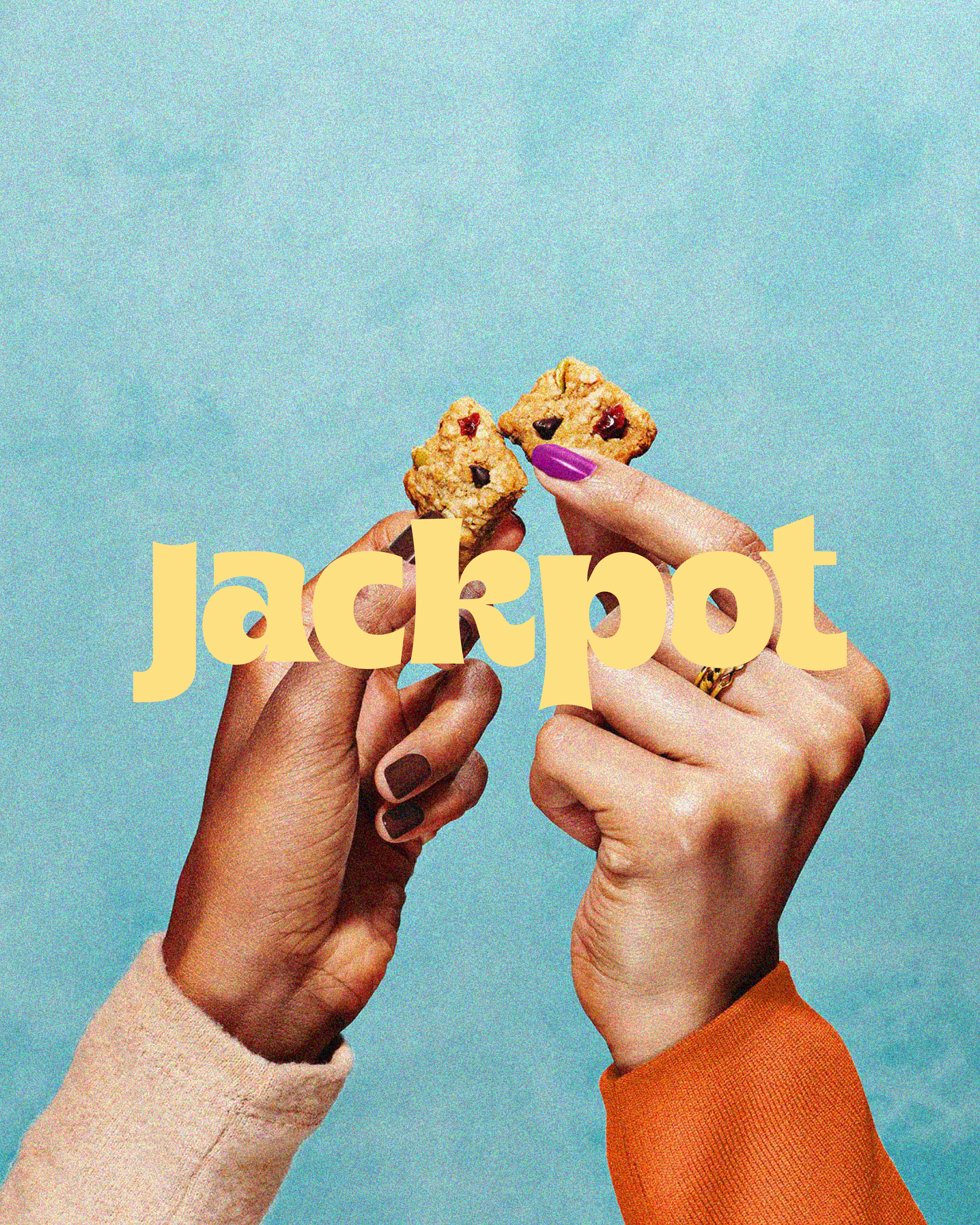
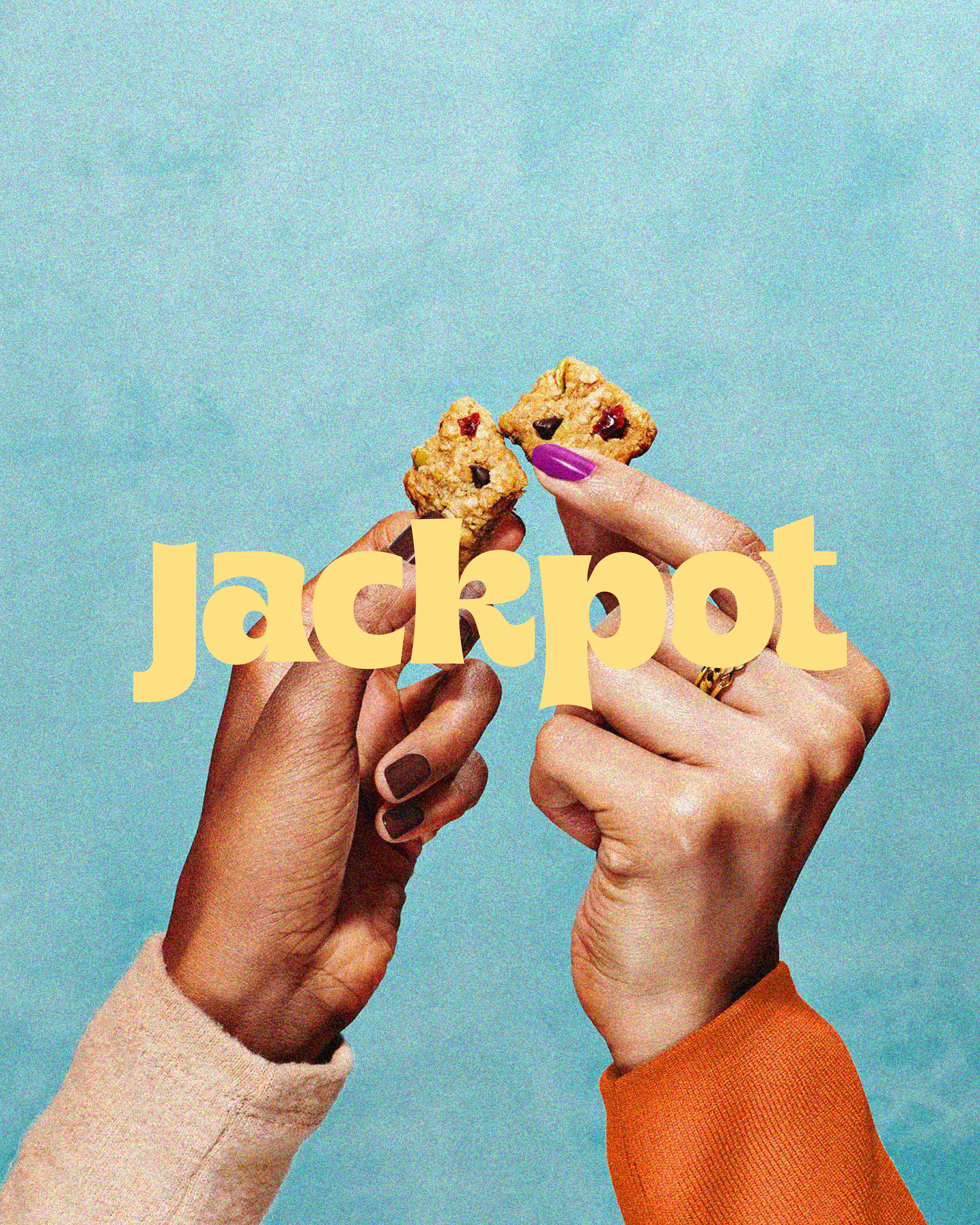
Jackpot Cookies is a Miami-based cookie brand with a playful personality and an indulgent product offering. The goal was to refresh its existing identity into something bolder, more recognizable, and built to grow. Through expressive typography, a vibrant color palette, and playful graphic elements, we created a cohesive visual world designed to stand out across packaging, merchandise, and digital touchpoints.
Created in collaboration with Samantha Glassman.
Services
Brand Identity Refresh, Logo Design, Color Palette & Typography, Brand Patterns & Graphic Elements, Packaging Design, Brand Guidelines, Art Direction & Mockups
The Rebrand
Before
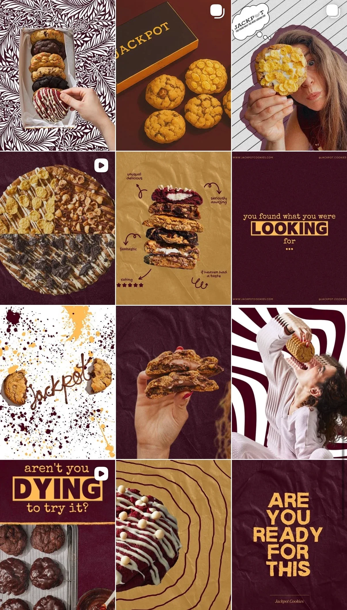
Jackpot Cookies had an established visual presence, but lacked a distinctive logo system and consistent graphic language. The opportunity was to build on the brand's existing personality while creating a more recognizable, flexible identity.
After
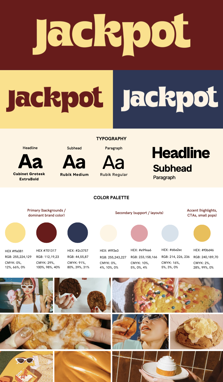
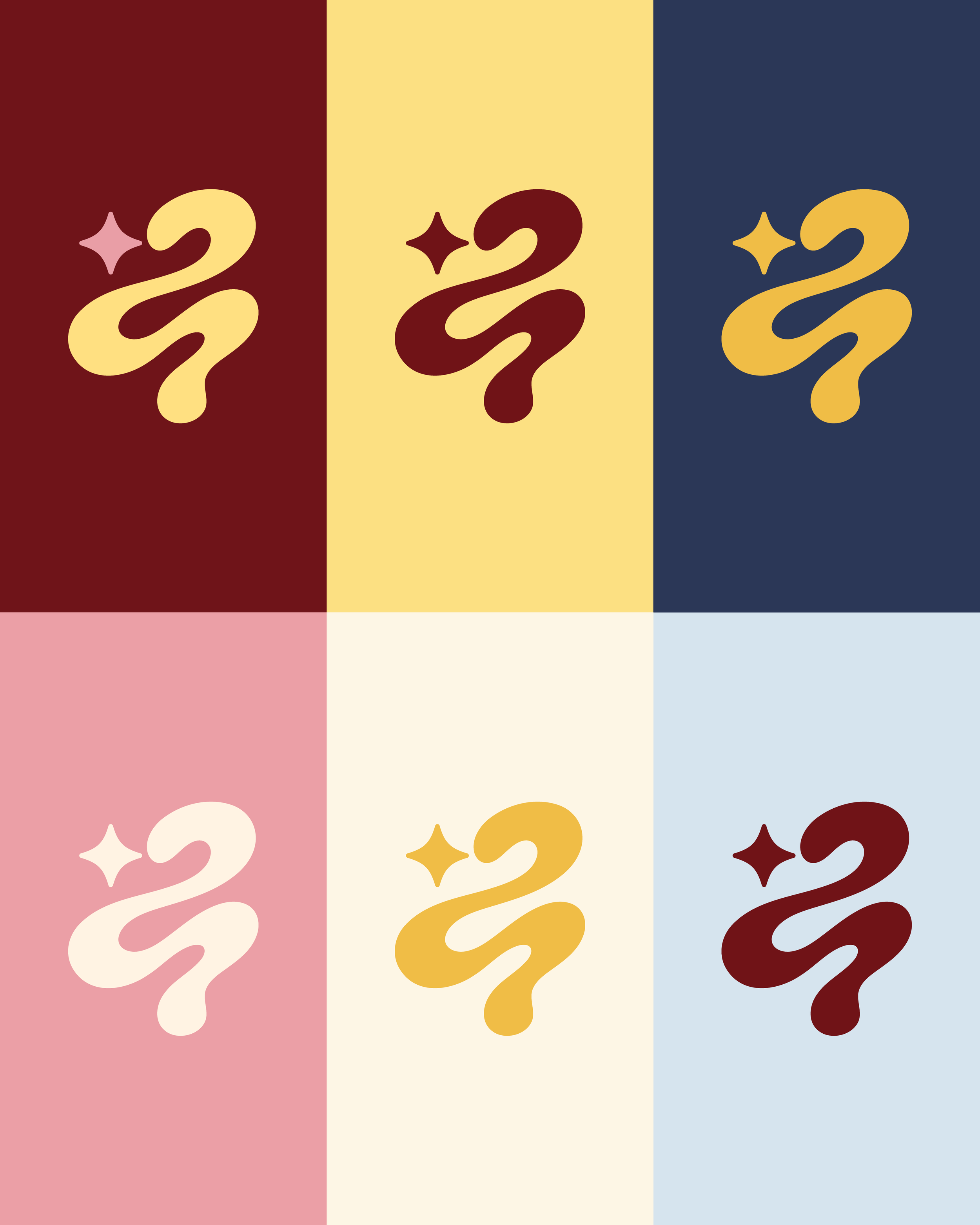
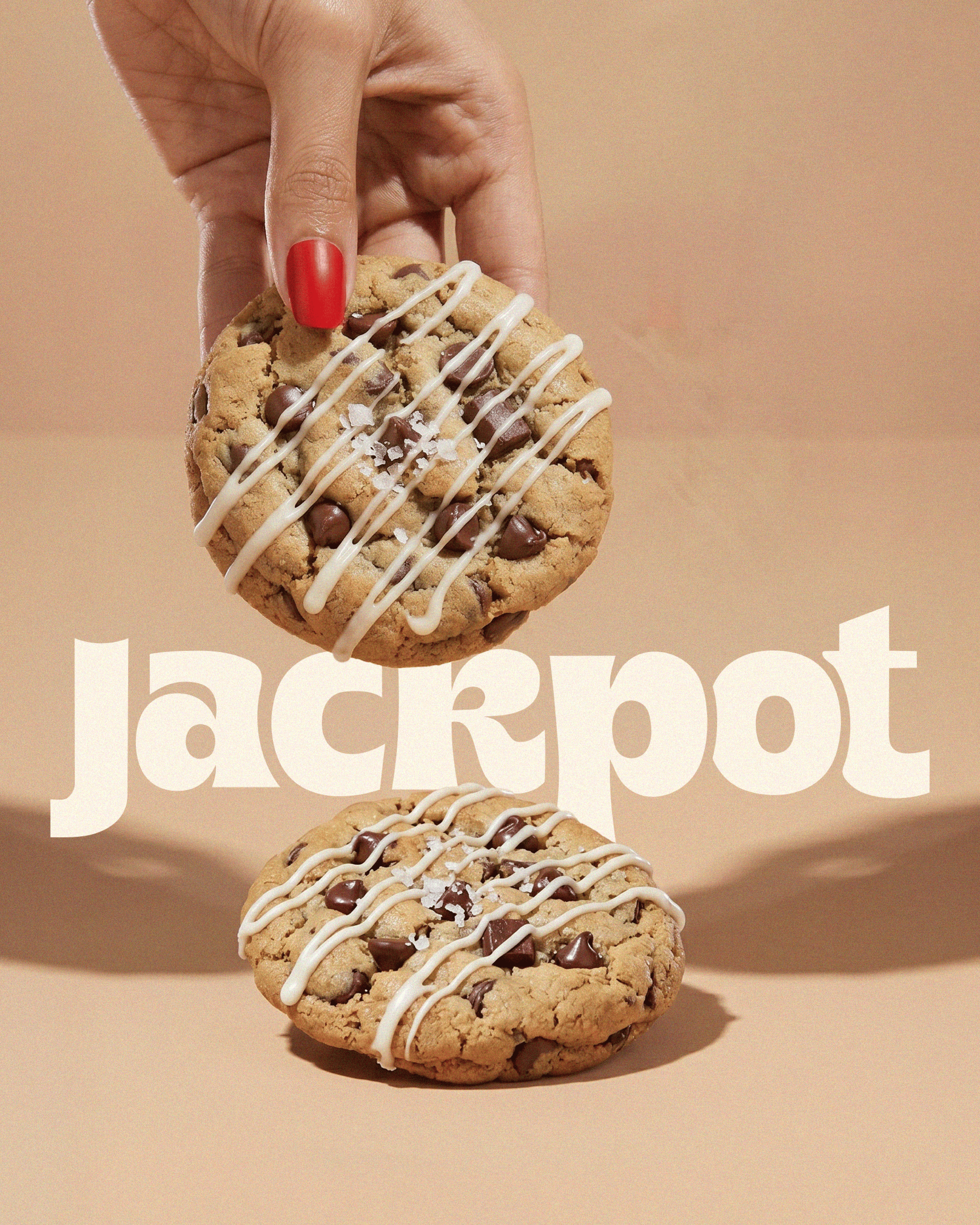
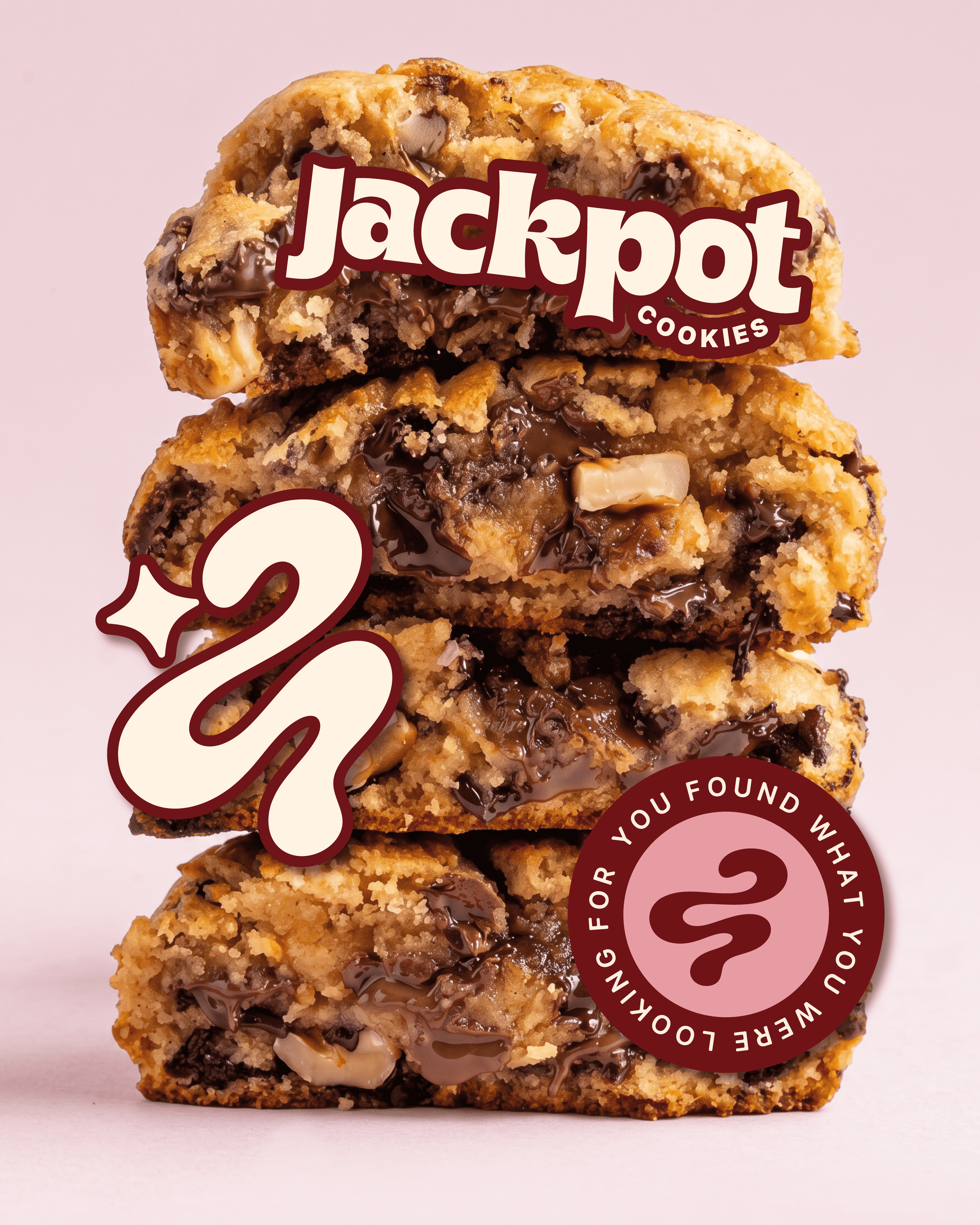
The refreshed identity introduces a bold, expressive logo system, vibrant color palette, and playful visual direction that captures the indulgent personality of Jackpot Cookies. Together, these elements create a more cohesive and recognizable brand world designed to translate seamlessly across packaging, digital, and lifestyle applications.
The Visual Identity
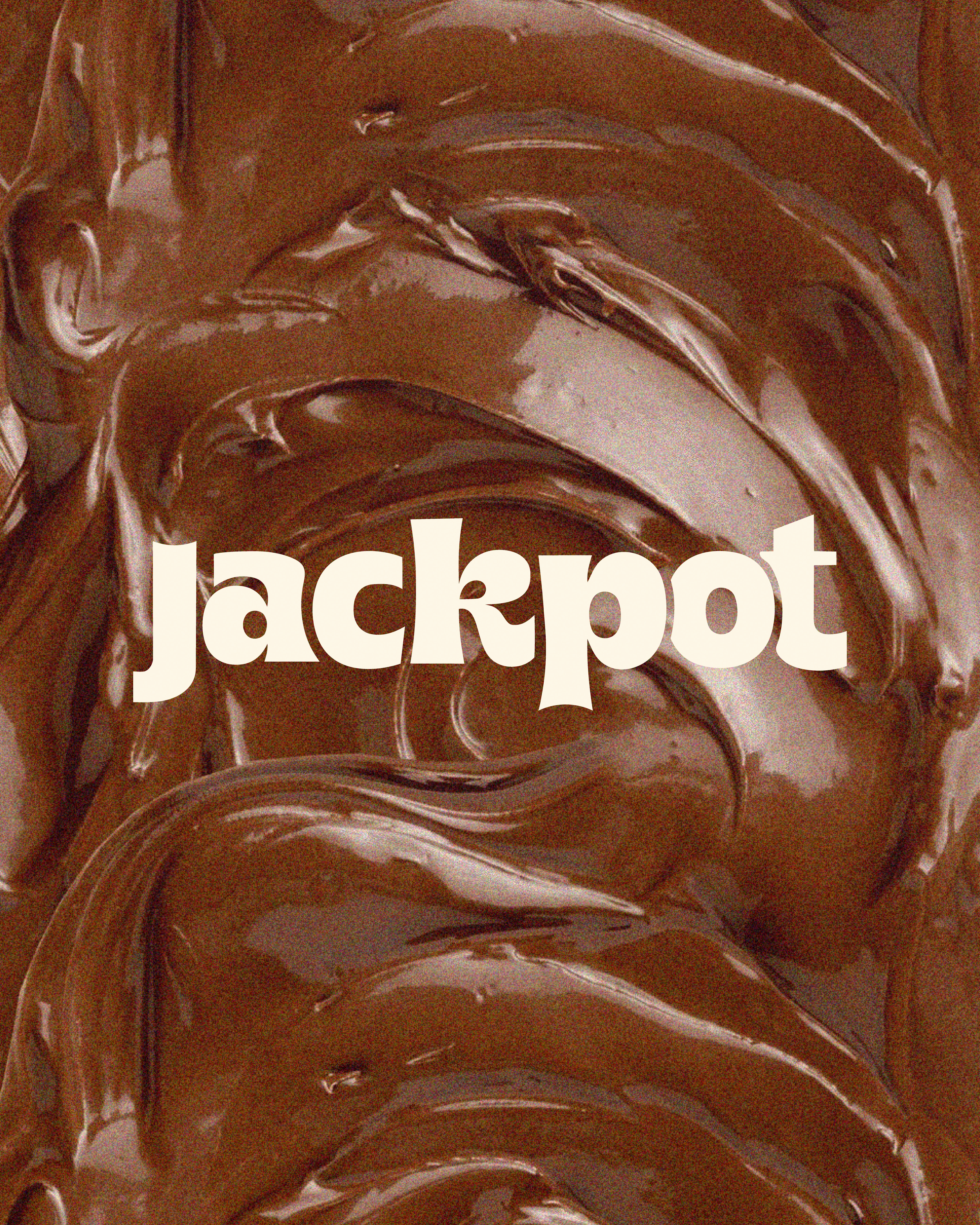
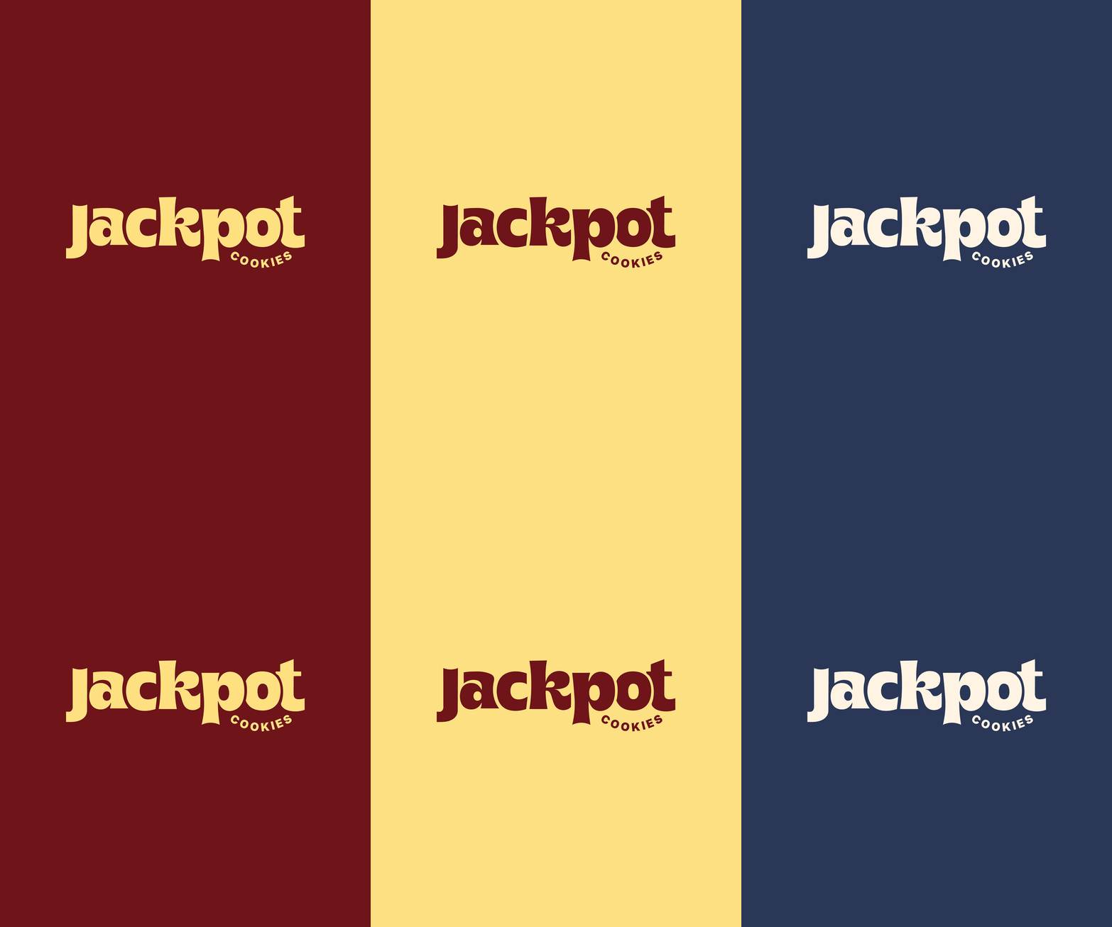
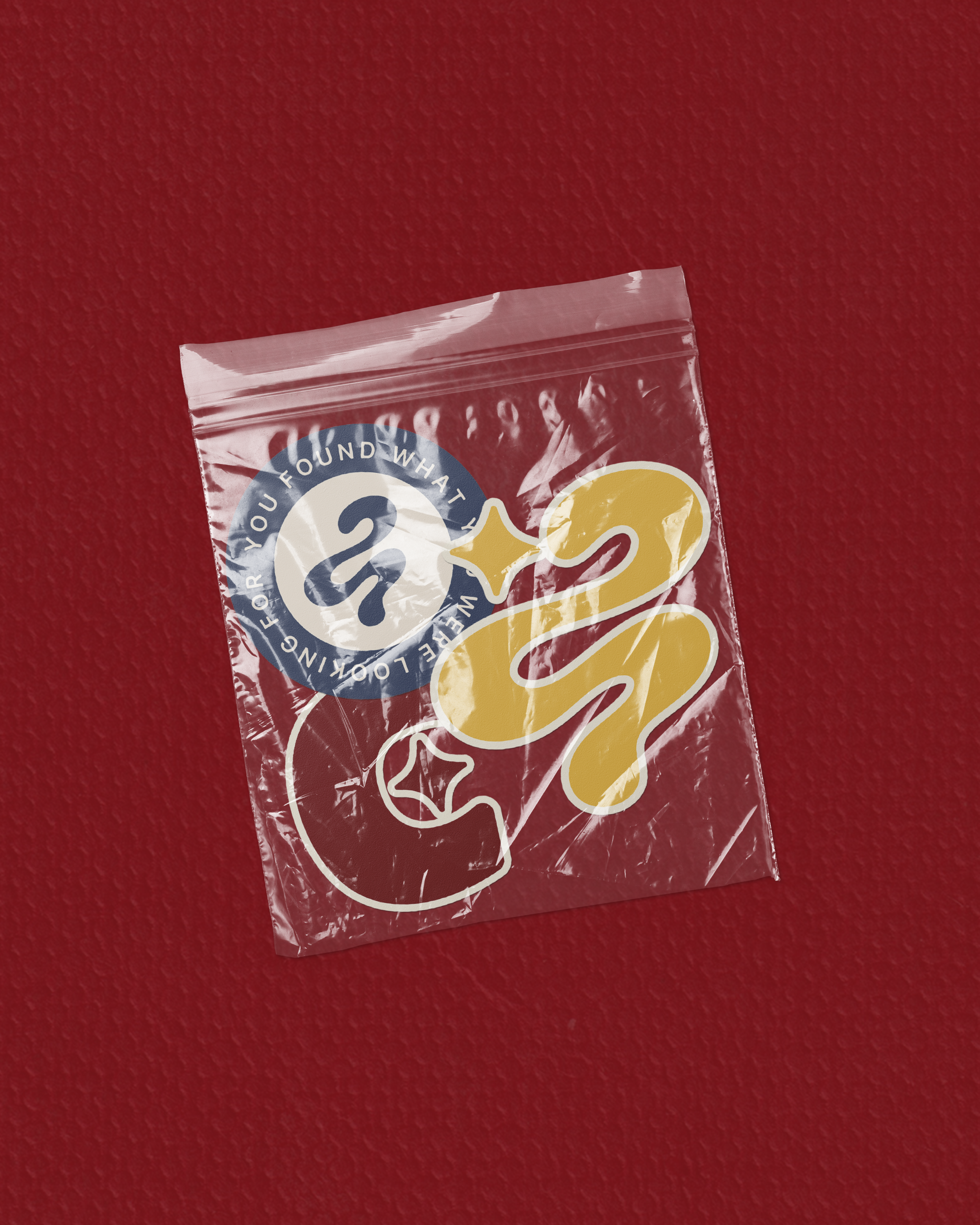
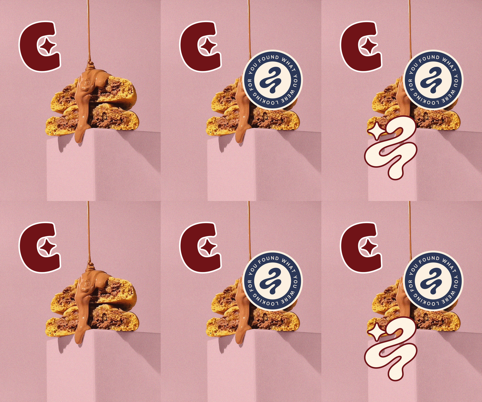
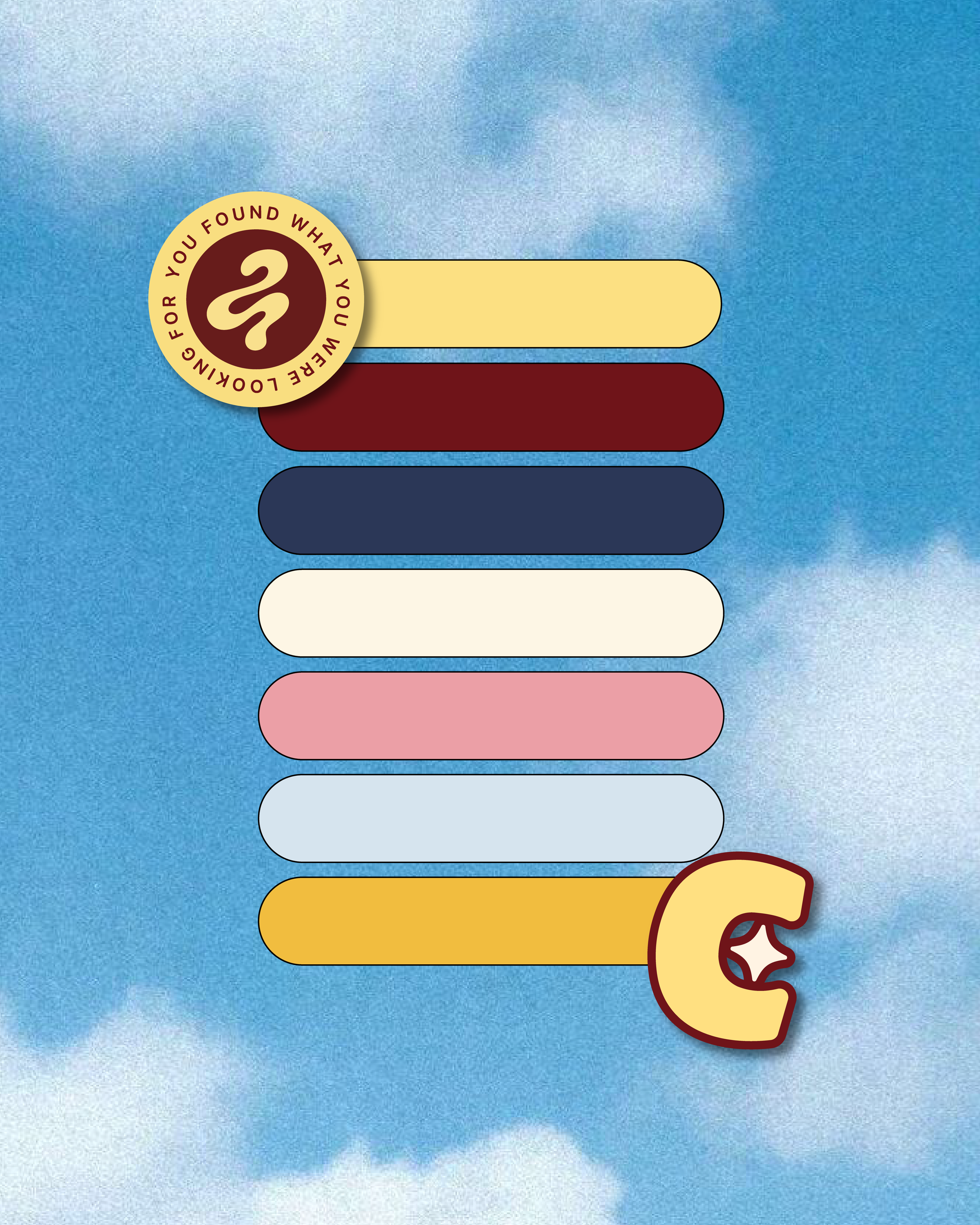
The refreshed identity was designed to feel as fun and indulgent as the cookies themselves. Bold, expressive typography, a vibrant color palette, and playful custom icons and patterns come together to create a recognizable, flexible brand system with plenty of personality.


The Brand in Action
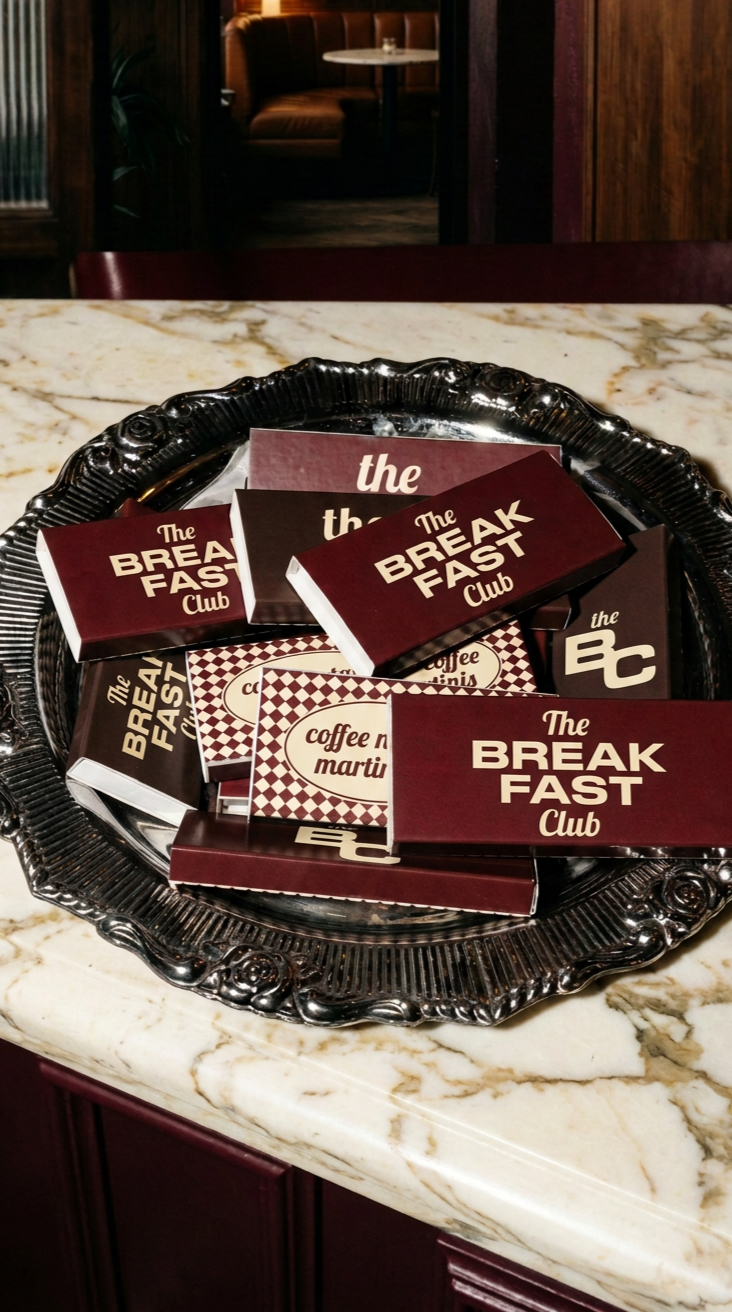
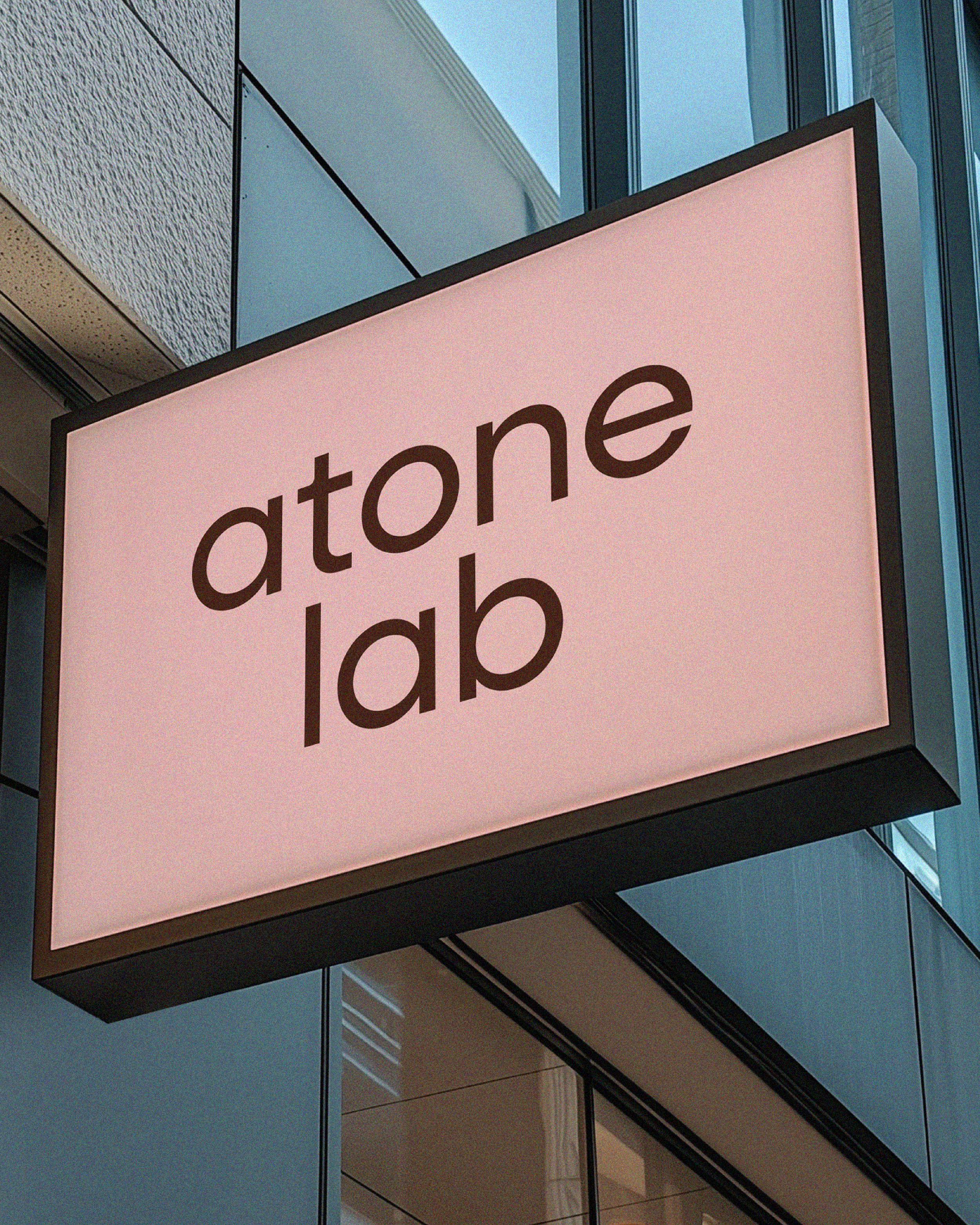
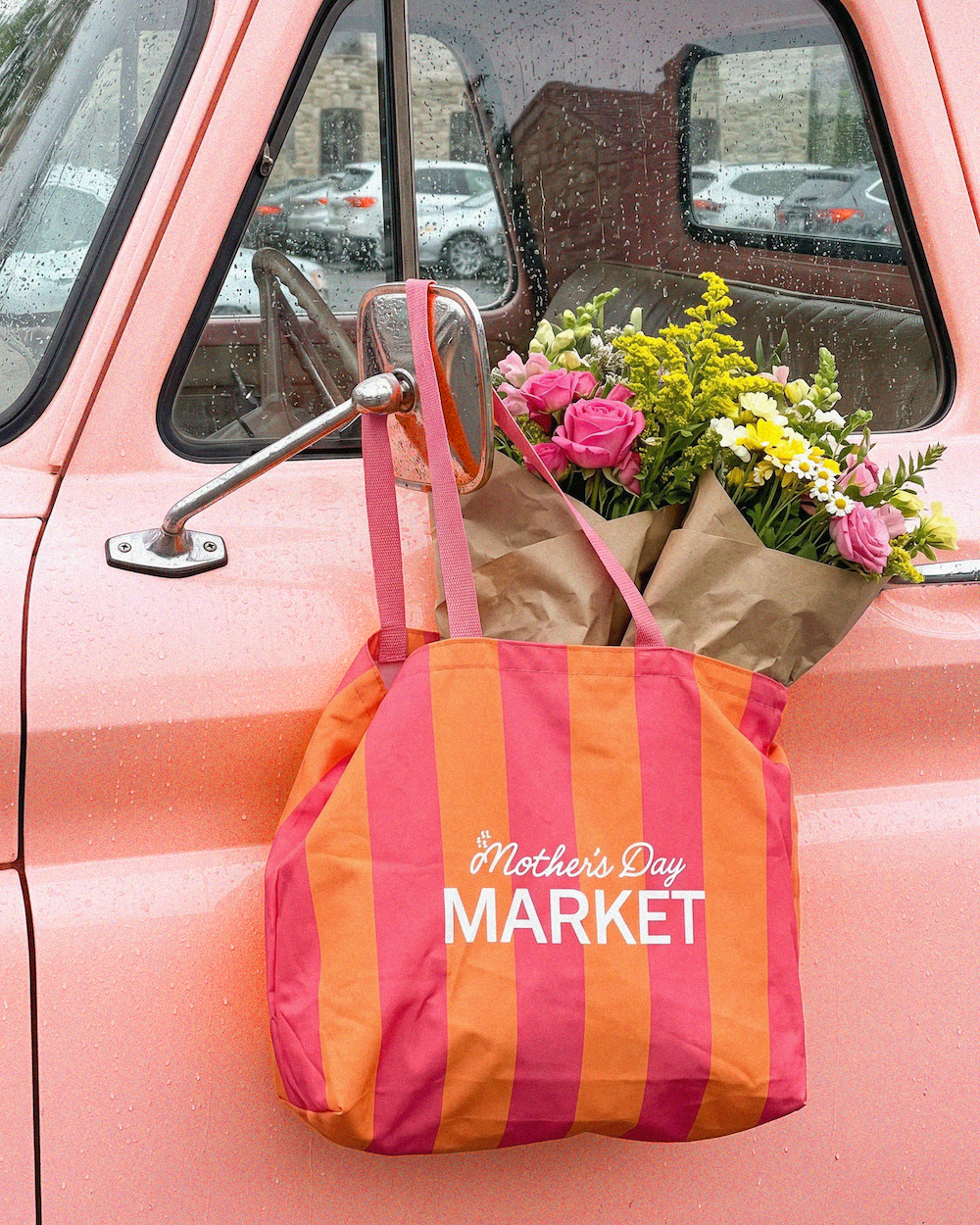
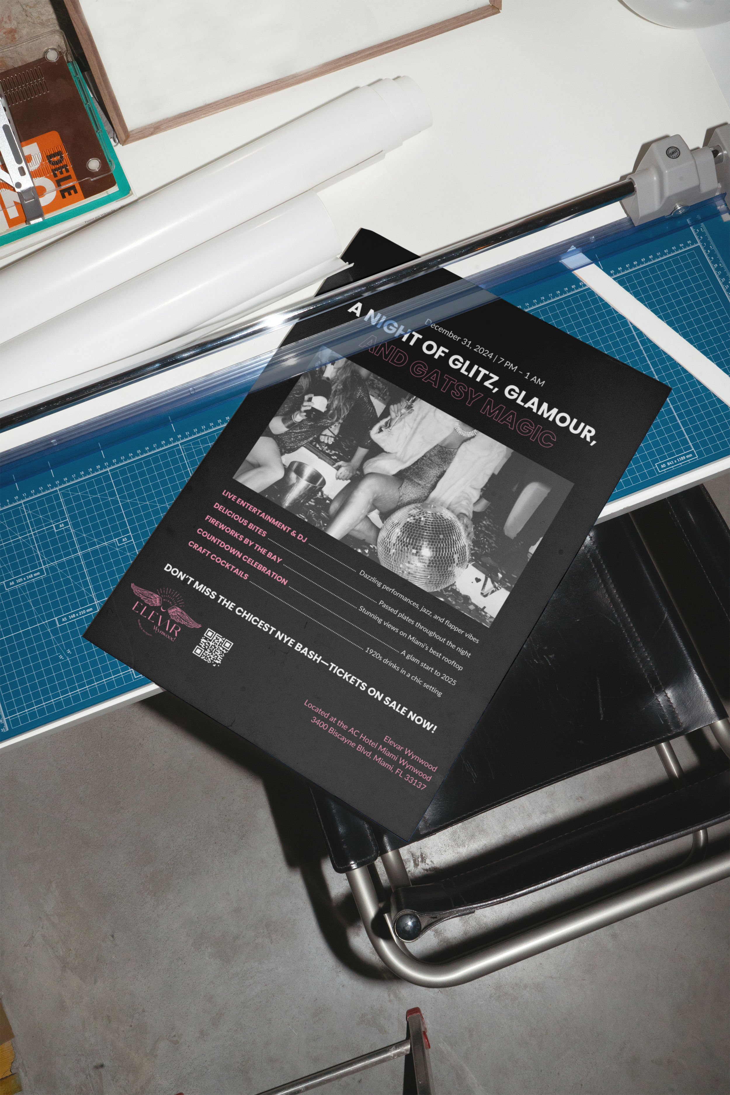
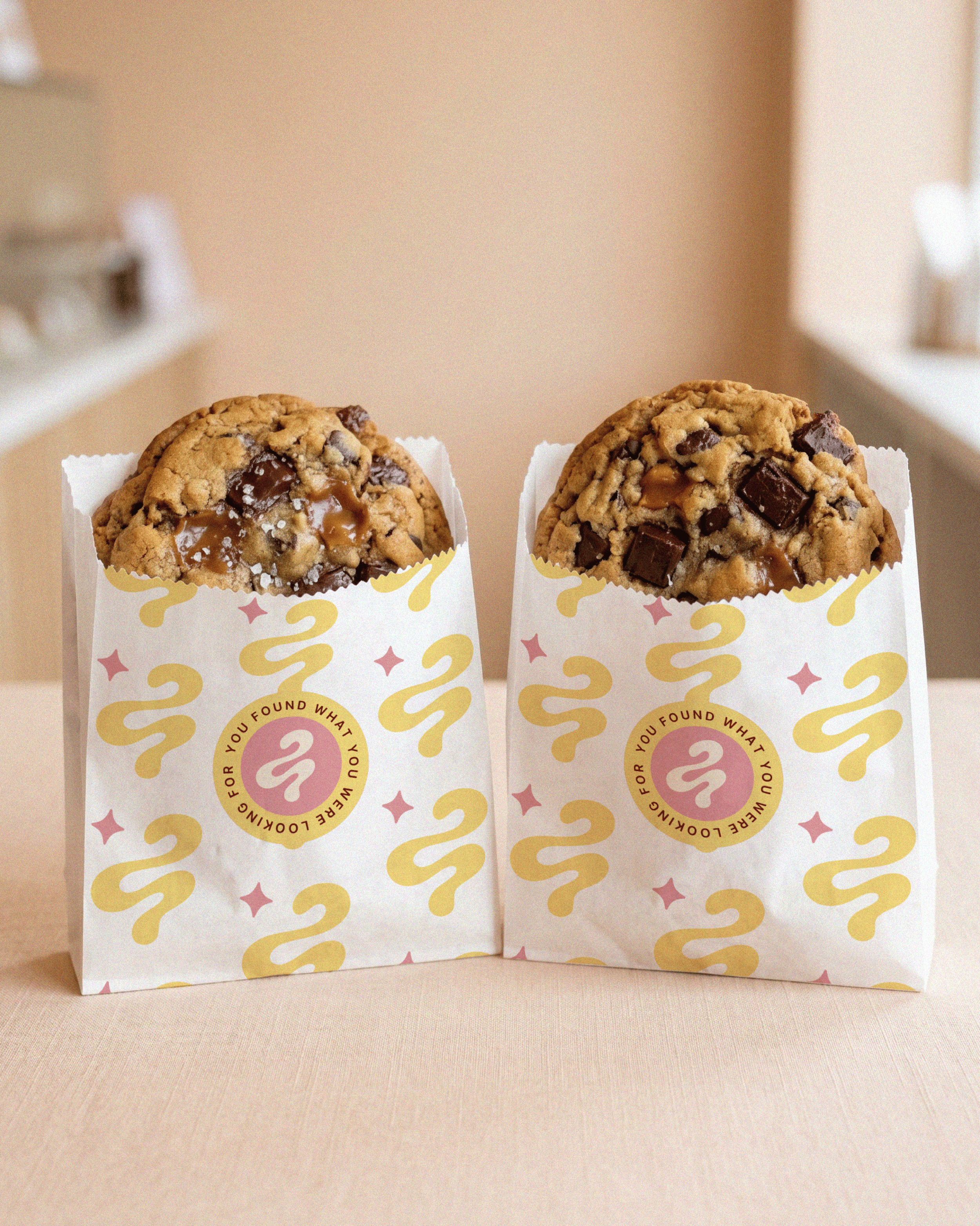
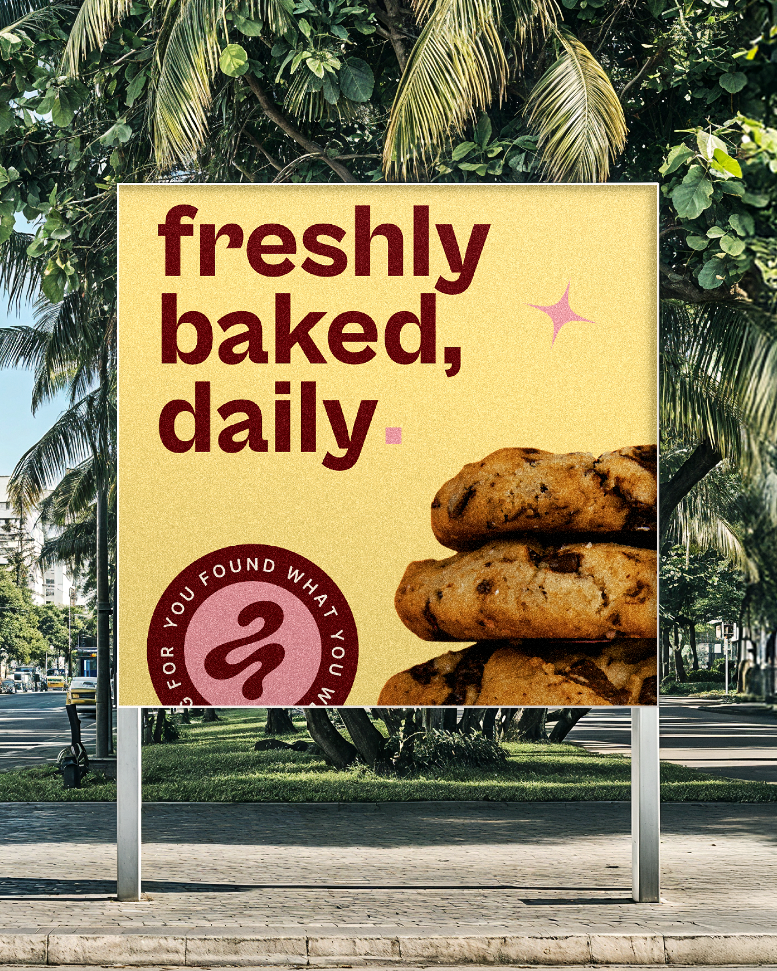
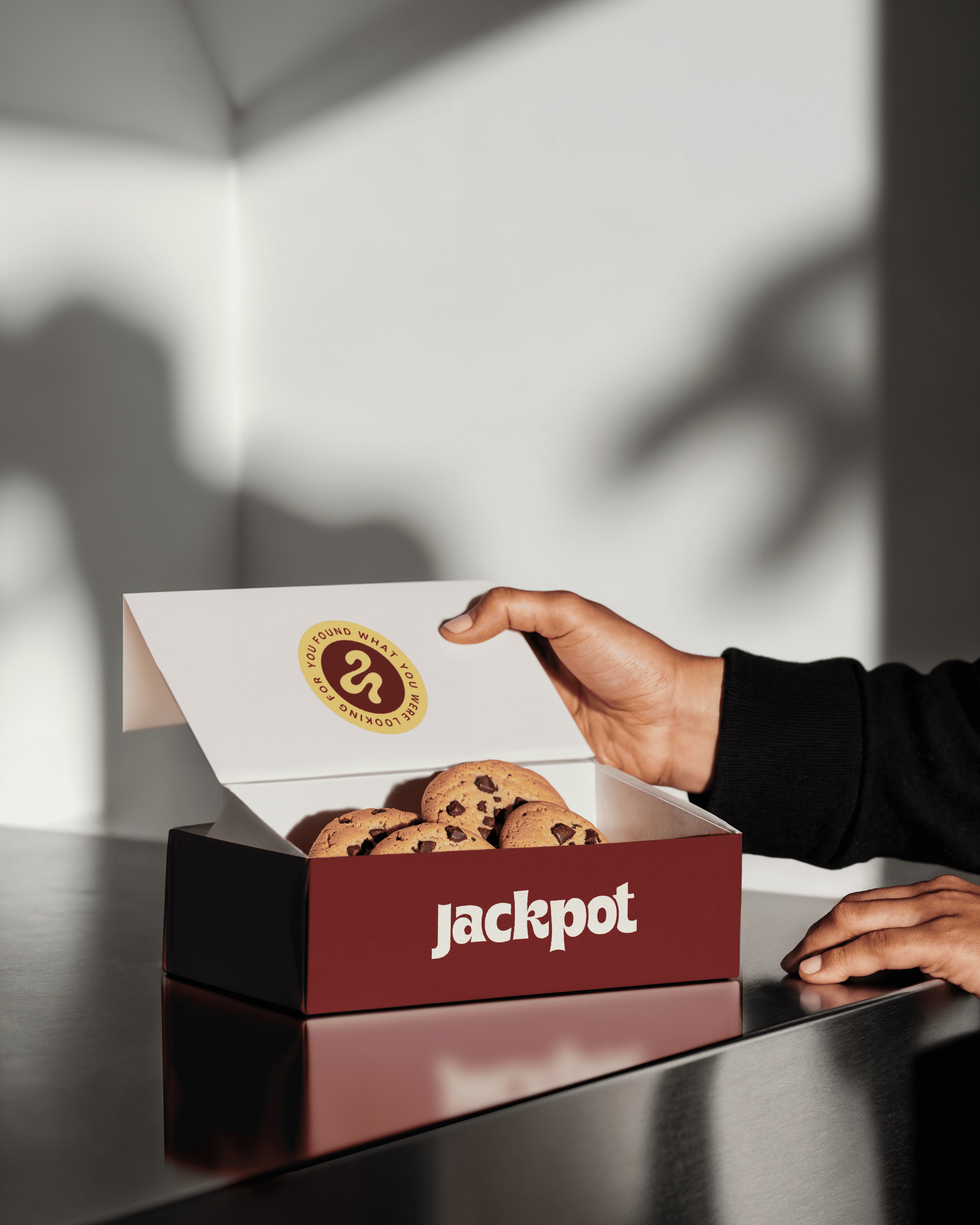
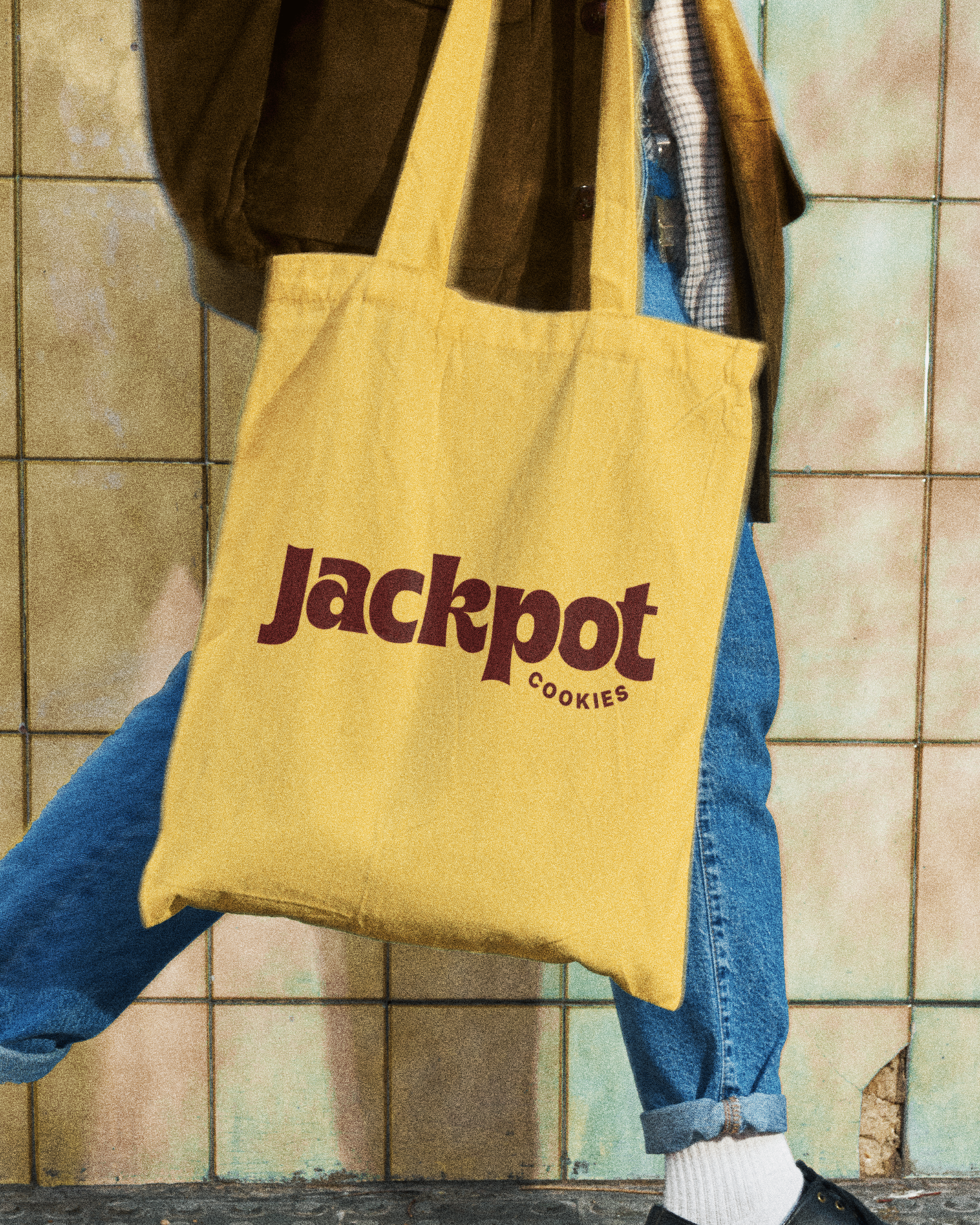
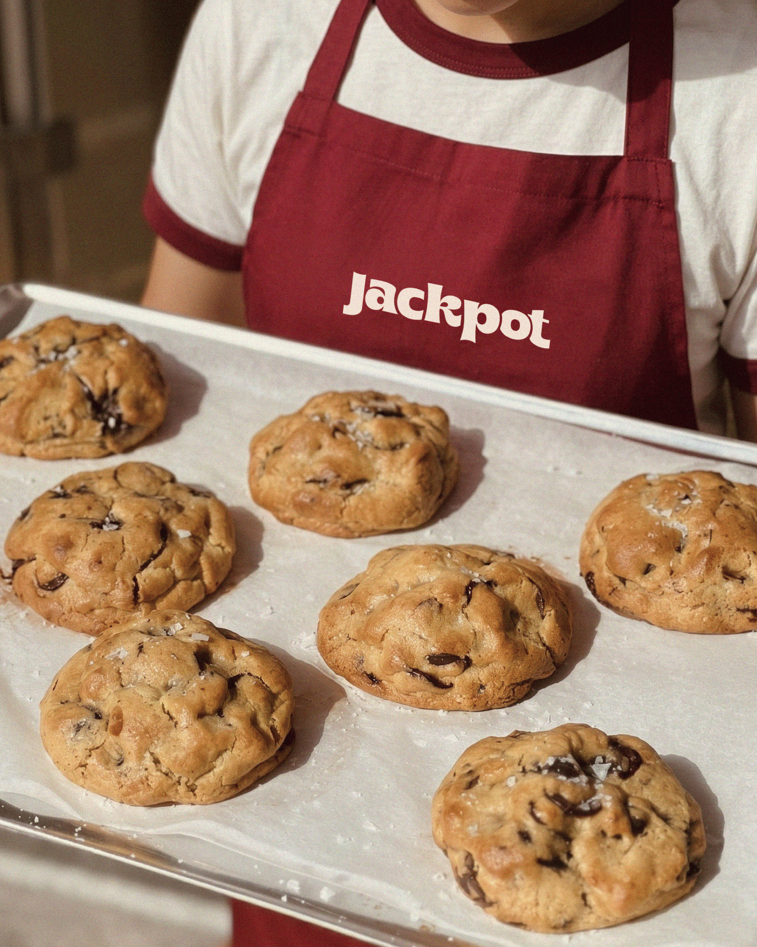
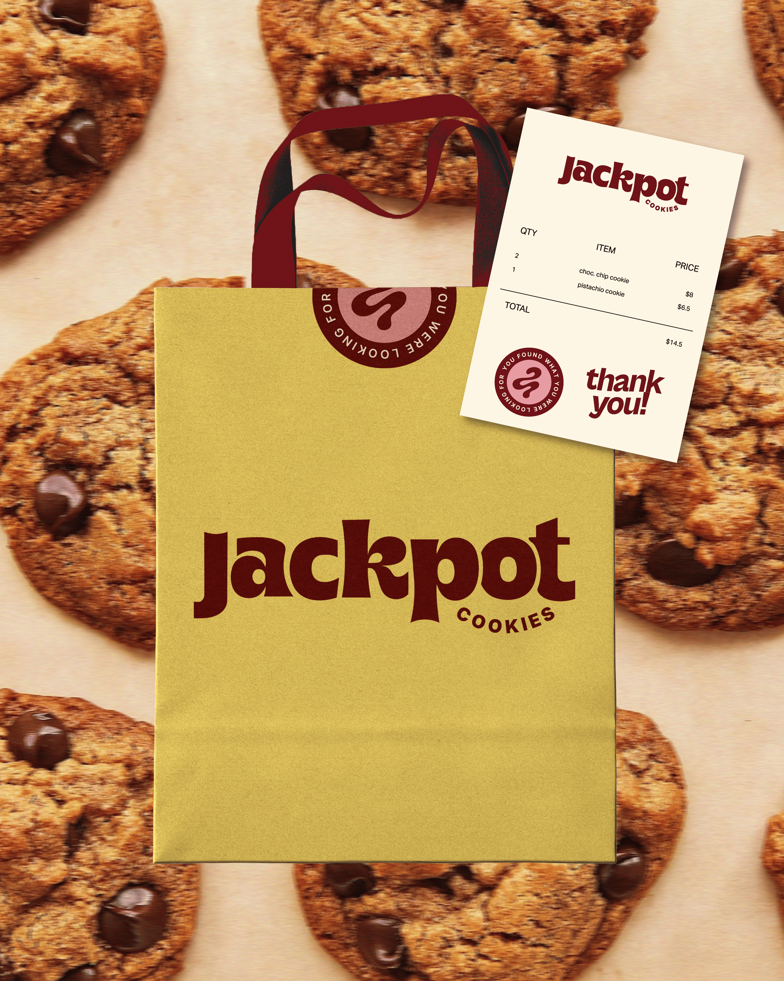
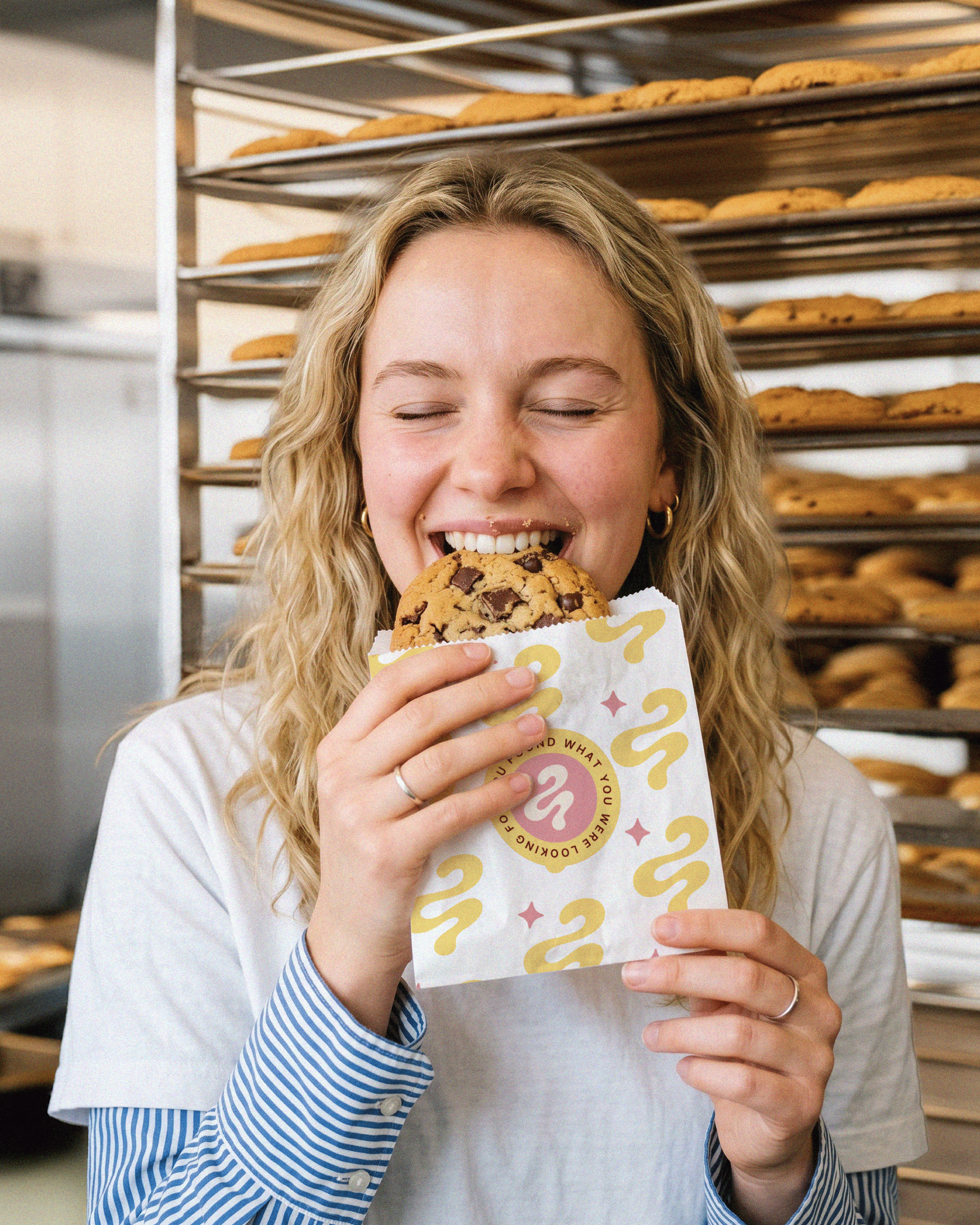
The new identity extends beyond the logo into packaging, merchandise, signage, and marketing. Each application brings Jackpot's playful personality to life, creating a cohesive brand experience across every touchpoint.
View More Work